Bearming Add-ons

Supercharge your Bear blog with our collection of powerful add-ons for the Bearming theme.
These add-ons give you even more ways to personalize your blog and add exciting new features. Imagine seamlessly adding a sleek image gallery or publishing a stylish page with book reviews.
Highlight menu
To use the highlight menu add-on styles below, see the page Highlighted Menu for Bear for instructions.
/* Highlight active menu item */
.home nav .nav-home a,
.blog nav .nav-blog a,
.contact nav .nav-contact a,
.search nav .nav-search a {
  color: var(--text-color);
  background: var(--accent-color);
  cursor: default;
}
Guestbook styles
/* Guestbook via guestbooks.meadowing.club */
#guestbooks___guestbook-messages-container blockquote {
  margin: -5px 0 40px;
  padding: 20px 30px;
  font-style: normal;
}
#guestbooks___guestbook-messages-header {
  margin:25px 0;
}
#guestbooks___guestbook-messages-header::before {
  margin-right: 8px;
  content: '💬';
}
Avatar title
In the code below, only keep the one you prefer, and delete the rest: square, round, star, polygon, flower.
/* Avatar */
.title h1::before {
  display: inline-block;
  margin: 0 var(--size-nano) 0) 0;
  content: "";
  background: url("https://link-to-your-avatar.jpg") no-repeat;
  width: var(--size-largest);
  height: var(--size-largest);
  background-size: var(--size-largest);

  /* Square */
  border-radius: var(--size-nano);

  /* Round */
  clip-path: circle();

  /* Star */
  clip-path: polygon(100% 50%,78.98% 57.76%,93.3% 75%,71.21% 71.21%,75% 93.3%,57.76% 78.98%,50% 100%,42.24% 78.98%,25% 93.3%,28.79% 71.21%,6.7% 75%,21.02% 57.76%,0% 50%,21.02% 42.24%,6.7% 25%,28.79% 28.79%,25% 6.7%,42.24% 21.02%,50% 0%,57.76% 21.02%,75% 6.7%,71.21% 28.79%,93.3% 25%,78.98% 42.24%);

  /* Polygon */
  clip-path: polygon(100% 50%,90.45% 79.39%,65.45% 97.55%,34.55% 97.55%,9.55% 79.39%,0% 50%,9.55% 20.61%,34.55% 2.45%,65.45% 2.45%,90.45% 20.61%);

  /* Flower */
  --g:/20.56% 20.56% radial-gradient(#000 calc(71% - 1px),#0000 71%) no-repeat;
  mask: 100% 50% var(--g),93.301% 75% var(--g),75% 93.301% var(--g),50% 100% var(--g),25% 93.301% var(--g),6.699% 75% var(--g),0% 50% var(--g),6.699% 25% var(--g),25% 6.699% var(--g),50% 0% var(--g),75% 6.699% var(--g),93.301% 25% var(--g),radial-gradient(100% 100%,#000 38.366%,#0000 calc(38.366% + 1px));

}
Post excerpts
To use the post excerpts add-on below, add the 'meta_description' attribute in your posts and use the description syntax for your embedded posts list (see the Bear documentation for more information).
/* Show post excerpts */
ul.embedded.blog-posts li {
  display: flex;
  flex-wrap: wrap;
  flex-direction: column;
}
ul.embedded.blog-posts li time {
  float: left;
  margin: 15px 0 0;
}
ul.embedded.blog-posts li a {
  overflow: visible;
  white-space: normal;
  font-family: var(--font-secondary);
  font-size: 1.2em;
  font-weight: bold;
}
Testimonials feature
To use the post testimonials add-on below (see example on the Bearming Testimonials) page, use blockquote for the text, bold for the name, and wrap it in a div with the class 'testimonials'. Example:
<div class="testimonials">

> The awesome text from someone.
**Some Name**

</div>
/* Testimonials */
.testimonials {
  display: flex;
  flex-wrap: wrap;
  row-gap: 20px;
  column-gap: 20px;
  margin: 30px 0;
  font-family: var(--font-secondary);
  font-size: .9em;
}
.testimonials blockquote {
  width: 310px;
  margin: 0;
  background: var(--accent-color);
  border: 2px solid var(--link-color);
  border-radius: 10px;
}
.testimonials p {
 display: flex;
 flex-direction: column;
 margin: 0;
}
.testimonials p::before {
  position: relative;
  margin: 0 0 -15px;
  content: "\275E";
  font-size: 3em;
  text-align: right;
  color: var(--link-color);
}
.testimonials strong {
  margin: 15px 0 20px;
  font-style: normal;
}
.testimonials strong::before {
  margin-right: 8px;
  content: "—";
}
Image gallery
To use the gallery add-on styles below, see the page Image Gallery for Bear Blog for example and instructions.
/* Gallery */
.gallery ul  {
  display: grid;
  grid-template-columns: repeat(3, 1fr);
  grid-auto-rows: 150px;
  grid-gap: 12px;
  padding: 20px 0;
  list-style: none;
}
.gallery li {
  position: relative;
  flex-basis: calc(50% - 20px);
}
.gallery img {
  width: 100%;
  height: 100%;
  object-fit: cover;
}
Image logo
 Replace the ’width’ and ’height’ values with the size of the image that you are using for your blog:
/* Replace logo text with image */
.title h1 {
  width: 300px;
  height: 100px;
  background: url("https://link-to-your-logo.jpg");
  text-indent: -9999px;
}
Search
To use the search add-on styles below, first read this Step-by-Step Guide: Implementing Search in Bear Blog by Yordi.
/* Search */
.blog input {
  margin: 10px 0;
  padding: 6px 12px;
  width: 200px;
  font-family: var(--font-secondary);
  font-size: .8em;
  color: var(--text-color);
  background: var(--accent-color);
  border: 1px solid var(--link-color);
  border-radius: 18px;
}
.blog ::placeholder {
  color: var(--link-color);
  opacity: inherit;
}
Statuslog
Integrate the Statuslog feature from omg.lol seamlessly with the styles of the Bearming theme. Simply add the statuslog script to the Bear footer directive and add the styles below to your theme (see it in action in my footer).
/* Statuslog */
.statuslol {
  display: flex;
  flex-wrap: wrap;
  gap: 0;
  margin: 30px 0;
  padding: 20px;
  font-family: var(--font-secondary);
  font-size: 1.1em;
  color: var(--text-color);
  background: var(--accent-color);
  border: 1px solid var(--link-color);
  border-radius: 10px;
}
.statuslol_emoji_container {
  min-width: 94px;
  flex: 0;
  font-size: 2.5em;
}
.statuslol_content {
  flex-grow: 1;
  flex-shrink: 1;
  flex-basis: 0;
  margin: -12px 0 0;
  text-align: left;
  overflow-wrap: break-word;
}
.statuslol_time {
  font-size: .9em;
  font-weight: bold;
}
Submenu
Add a submenu like the one at the top of this page (Theme, Add-ons, Palettes) to any of your pages.
/* Sub navigation */
.submenu a {
  margin: 0 8px 0 0;
  padding: 5px 9px;
  font-family: var(--font-secondary);
  font-size: .8em;
  font-weight: normal;
  text-decoration: none;
  background: var(--accent-color);
  border-radius: 5px;
}
.submenu a:hover {
  color: var(--text-color);
}
.submenu-nolink a {
  color: var(--text-color);
  cursor: default;
}
To implement it, add the code below to your page. Use the submenu-nolink part for the menu item you want to display as active.
<span class="submenu"><span class="submenu-nolink">[One](/one/)</span> [Two](/two/) [Three](/three/)</span>
Announcement bar
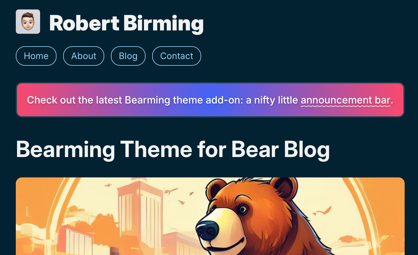
To use the announcement bar add-on styles below, check ot the Bear Blog Announcement Bar post on how to implement it properly.
/* Announcement bar */
.bar {
  margin: 20px 0;
  padding: 15px;
  font-size: .9em;
  line-height: 1.5;
  font-weight: 500;
  color: #ffffff;
  text-align: center;
  text-shadow: 1px 2px 4px rgba(0,0,0,0.2);
  background: rgb(63,94,251);
  background: radial-gradient(circle, rgba(63,94,251,1) 0%, rgba(252,70,107,1) 100%);
  border: 2px solid var(--accent-color);
  border-radius: 10px;
}
.bar a {
  margin: 0;
  padding: 0;
  font-size: inherit;
  color: #ffffff;
  text-decoration: underline;
  text-decoration-thickness: 1px;
  text-underline-offset: 3px;
  text-decoration-style: wavy;
  border: none;
}
.bar a:hover {
  background: none;
}
Share buttons
To use the share buttons add-on styles below, check ot the Bear Share Buttons post on how to add them to your blog posts.
/* Share buttons */
.share {
  margin: 40px 0 25px;
  padding: 0;
  list-style: none;
  font-family: var(--font-secondary);
  font-size: 14px;
}
.share li {
  display: inline;
  margin-right: 7px;
}
.share a {
  padding: 6px 10px;
  color: var(--link-color);
  text-decoration: none;
  border: 1px solid var(--link-color);
  border-radius: 6px;
  background-color: var(--background-color);
}
.share a:hover {
  background-color: var(--accent-color);
}
.share .material-icons {
  font-size: 17px;
  color: var(--link-color);
  vertical-align: text-top;
}
Timeline
To use the timeline add-on styles below, see the page Timeline for Bear Blog for example and instructions.
/* Timeline */
.timeline {
  margin: 40px 0;
}
.timeline ul {
  padding-left: 20px;
  border-left: 6px solid var(--accent-color);
}
.timeline li {
  margin: 0 0 25px;
  padding: 10px 25px;
  list-style: none;
  background: var(--accent-color);
  border-radius: 10px;
}
.timeline h4 {
  position: relative;
  margin: 10px 0 0;
  padding: 8px 15px 6px;
  font-size: .8em;
  text-align: center;
  text-transform: uppercase;
  background: var(--background-color);
  border-radius: 7px;
}
.timeline h4::before {
  position: absolute;
  top: 10px;
  left: -55px;
  content: "";
  width: 15px;
  height: 15px;
  border: 5px solid var(--text-color);
  border-radius: 999px;
}
Button
/* Button */
.benjamin a {
  display: block;
  margin: 0 auto;
  padding: 12px 15px;
  width: 150px;
  font-family: var(--font-secondary);
  font-size: .8em;
  font-weight: bold;
  text-transform: uppercase;
  text-decoration: none;
  text-align: center;
  border: 1px solid var(--link-color);
  border-radius: 30px;
}
.benjamin a::after {
  padding-left: 7px;
  content: "➔";
}
.benjamin a:hover {
  background: var(--accent-color);
}
To use the Button add-on, simply add the following code and adjust it to fit your needs.
<div class="benjamin"><a href="/something-awesome/">Something awesome</a></div>
Unlikely button (hide upvote counts)
/* Unlikely button */
.upvote-button svg,
.upvote-count {
  display: none;
}
button.upvote-button {
  display: block !important;
  margin: 25px 0 5px;
  padding: 4px 9px;
  font-family: var(--font-secondary);
  font-size: .9em;
  font-weight: bold;
  color: var(--link-color);
  border: 1px solid var(--link-color);
  border-radius: 6px;
  cursor: pointer;
}
.upvote-button::before {
  content: "☆ ";
}
.upvote-button::after {
  content: "Like it?";
}
.upvote-button[disabled]::before {
  content: "★ ";
}
.upvote-button[disabled]::after {
  content: "Thank you!";
  cursor: default;
}
.upvote-button.upvoted {
  color: var(--link-color) !important;
  background-color: var(--accent-color);
}
.upvote-button:hover {
  background-color: var(--accent-color);
}
Sparkling logo
Based on the wonderful gradient sparkles idea by Sylvia, this add-on adds a sparkling look and feel to your blog title.
/* Sparkling logo */
.title h1::after {
  content: "*:・゚✧";
  background: linear-gradient(90deg, var(--accent-color) 0%, var(--link-color) 50%, var(--visited-color) 100%);
  color: transparent;
  background-clip: text;
}
Nano Blog
Add a simple status update to the footer of your blog. See the Bear Nano Blog for instructions about how to add it.
/* Nanolog */
.nano {
  display: flex;
  flex-wrap: wrap;
  gap: var(--size-regular);
  margin: var(--size-large) 0;
  padding: var(--size-micro) var(--size-regular);
  border: 1px solid var(--link-color);
  border-radius: var(--size-nano);
  background: var(--accent-color);
}
.nanoji {
  flex: 0;
  font-size: var(--size-mega);
  min-width: var(--size-mega);
}
.nanoted {
  flex: 1;
  text-align: left;
  overflow-wrap: break-word;
}
.nano blockquote {
  margin: 0;
  padding: 0;
}